
Did everyone survive Friday the 13th? There's two more this year. I was going to post yesterday but didn't get around to it.
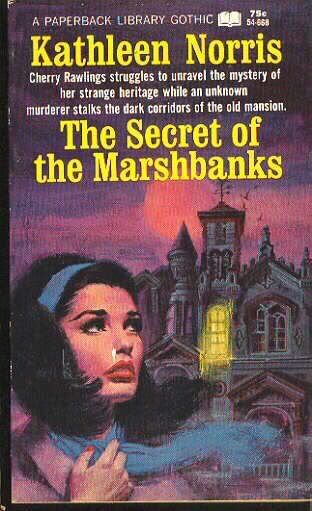
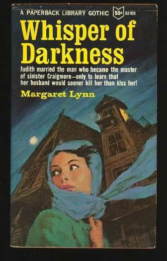
The cover art on these is especially beautiful, and I couldn't resist owning "Whisper of Darkness" - that is THE scan for the book I now have. :-D Both cover scans from BookIT.com:


2 comments:
Totally agree about the Whisper cover. It's essentially the same as the other one with identical elements (a girl in the extreme foreground and a house in the back) but Whisper is so much more dynamic by the simple artistic choice of lowering the angle and making the house appear more ominous. Her eyes are shiftier, even the wind is gustier on Whisper, compare those blowing scarves. Fantastique!
Hi Karswell: I also think "Marshbanks" is too colorful for a Gothic.
Post a Comment